 alternative use: for heat
 alternative use: game (lean it against something, like, a wall)
 alternative use: cat dorm
connotation for chair: bum magnet

alternative use: for heat alternative use: game (lean it against something, like, a wall) alternative use: cat dorm
connotation for chair: bum magnet


"Who designed it"- Frank Gehry, so famours now he can b called a "starchitect": he did the guggenheim in Bilbao which I saw last summer: amaaazing!!! so here he is all famous in front, then there's his "dancing house", then he was featured in the simpsons (shows his way of working/getting inspired) and then last one is the "star wood hotel" he designed.


"How it was made": going back to how cardboard was made, fast growing trees, (pulp mill kraft process etc not scanned) then 3 layers of kraft paper to make corrugated cardboard, then there's young(er) Frank Gehry about to "play with it, to glue it together and to cut it into shapes with a handsaw and a pocket knife" (quote from 50 chairs that changed the world book I mentioned in the previous post). Then he finds out what happens when u layer the cardboard- then decides to cut out 60 of these wiggly shapes in corrugated cardboard, + two in hardboard for the edges, n assembles them with glue, hidden screws, and puts white lacquer on the hardboard edges (optional though).


"Where was it used" Powerhouse Museum Collection (Sydney), Design Museum (London), decoration (they made a "mini" version), and the MoMA (New York)


"Who did it belong to"- 1st one is Rolf Felbhaum chairman director of the Vitra company (belongs more to the company than to him, so I also did one with just the company logo but not very interesting obviously), 2nd is Frank Gehry again, 3rd is some guy called Edgar Smith, not sure he's the right one as there are tons of Edgar Smiths, but apparently one of them gave a wiggle side chair to the MoMA collection (New York).


"What is it made of" cardboard, some glue and hidden screws. read all about the carboard manufacturing process and went back to the raw raw materials. + the screws.


 and that's a quick drawing of the book in which I found out about it (at the design museum), it's part of the 60 drawings in the "where was it/is it used" category
"Young man in gas mask in the bus in western-ukranian city L'vov. Panic due to swine flu is being increased artifically in Ukraine. This can be connected to up-coming president elections"
source: http://fishki.net/comment.php?id=60463, thanx Nikolay for finding it and translating =)
That's pretty much exactly what I wanted to say, I mean I didn't have the up-coming Ukranian president elections in mind, more the pharmaceutical industry who would be pretty sad to have spent so much money in research for nothing, but yeah, I guess the gas-mask idea it is then?
 Quite a few people liked this one best, apparently it's quite eye-catching and works well from a distance, I'd probably do the text more like in the escalator one though or could even do without it. One person said she couldn't quite figure out why the girl was scared though, that it wasn't clear that everyone was coughing and sneezing in the tube- well I will have to make it a lot clearer and neater if I do it for the final, my concern is that it's a bit complicated though so it might not be so easy to make it all that clear.
 Two people liked this one best, they liked how you can't see where the sneeze is coming from- getting the whole paranoia idea through, and how the text merges with the table outlines. One person said I should put the "ATCHOO" in some sort of speech bubble because it wasn't clear if she was thinking it or hearing it or sneezing herself. Aside from this three though people didn't really comment on this one, I think that the reason why a lot of people were attracted to the tube and escalator ones is because of the shadowy faces, so I might try to re-do this one and the cat one with shadowy/scared faces, because I think they're a bit more subtle and the composition work well, especially the cat one.
 The feedback was mainly that the guy doesn't look scared enough, and the cat should maybe be a bit more centred? (not sure about that though), and that the message wasn't as clear/hard hitting as in the tube or gas mask one.. That point is the one that worries me with this one, I personally thought it was pretty clear, but maybe it's because I've been looking at a lot of political drawings/cartoons on the subject where there is a cow, a chicken and a pig all ganged up and suggesting what next (in one of them there's an elephant, maybe I should post a couple on here)... So I don't know now, I guess I could try it again with a shadowy face?
 A few people liked this one best, really straight forward humour I guess, and clearly showing an over-the-top attitude with this flu thing, but I guess even though the mask symbol is one of the most effective, people instantly recognize it, it's kind of too easy... not original enough... Well maybe I'm just making things more complicated, but the more I look at it the more I find it boring.
 This one came just after the tube one I think for a lot of people, one person's favorite. It was originally the one I liked least (now I think it's the mask one), and one other person felt the same way, couldn't really explain why either though, too simple? It's just too plainly getting back at the NHS ad, kinda cheap now that I think about it.
 Love this cartoon by Solìs for the Mexican newspaper Excelsior - Sempé style, one of my favs
  "Reading" by Alfred Megally
 1918 poster by Clifford Berryman
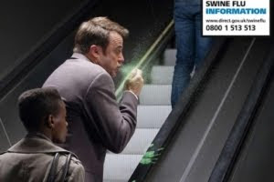
What got my attention were the "if you could see germs" posters in the tube, could only find one of them on internet and it's really small, but here's one of their TV ads, the first 19 seconds are what I'm talking about
 Brief: illustrate a headline from the 5th of November 2009, headline: "There's no such thing as free speech in politics" from The times (we weren't suppose to base the illustration on the article, just on the headline). Part of the point of this project was to make us understand how it is to work under pressure for time a bit more like an editorial illustrator would I think.
 A lot of people liked this idea best, I did too, but it's true that it isn't as original.


For this brief we had to pick a fairy tale/folk story and illustrate it in 5 images, minimum size A4.
You can read the story on : http://www.surlalunefairytales.com/beautybeast/stories/smalldog.html (same website I got the Gustave Doré images from)
Evaluation... I guess the only good thing about these is the light in the first image. I wanted to try to change media- charcoal and pastels in addition to some ink and watercolour pencils.. try to make it a little less precise, I was told for the previous project that I was being too rational, but I'm really not happy with the result, I should have done a lot more visual research and done a few roughs before going straight into the "final" drawings, I didn't manage my time very well. I did try to include some of my "image kit" in there: the eyes in the background of the third image, and I meant for the girl to be the same one as in my summer project, but I re-read the story and thought she was too young so it wouldn't have worked.


